Fonts from the Network
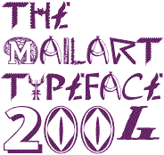
The Mailart Typeface is made up of letters, numbers, punctuation marks and symbols sent to me from almost 130 mailartists from around the world. The project was initially by invitation to mailartists known for the strong graphic qualities in their work, but some keystrokes were allocated to interested individuals looking at my website and others who were recommended by participating artists.
The Mailart Font is copyright free and available to download from this site, and from other mail art and free font sites. The accompanying Read_Me file includes a full address list of the contributors.�
In 2012, the Mailart Typeface was included in the exhibition of fonts on display at the German Museum of Books and Writing in Leipzig.�


The Ray Johnson Small Capitals font is inspired by the Father of Mail Art and is based on the block lettering style used by Ray to add the names of his correspondents to their bunny head portraits (the film 'How to Draw a Bunny' is a superb introduction). The font includes blank bunny heads and other Ray Johnson graphics as scalable vector images, and separate bitmap images are also provided as jpegs and gifs.

Since discovering Fontographer in 2001, designing fonts has increasingly competed for time with Mail Art, though the two have certainly influenced and enriched each other. Mailart Rubberstamp is inspired by the Mailart rubberstampings of Jonathan Stangroom, H. R. Fricker, Flea Art (and others) and the typeface Clarendon Condensed.
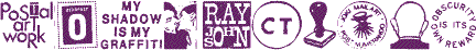
The Mailart Graphics picture font is made up of symbols, images and stamps from the mailart network and the scrapbook on my Mac. This font is free for personal use; commercial copyright is retained by artists named in the ReadMe documentation. �

The Obscure Actions wordfont, designed for Vittore Baroni's OA04 mail art project, is a collection of words and phrases from mail art sources. Each uppercase and lowercase keystroke accesses different words to create random associations, like cutting up and rearranging newspaper words. �
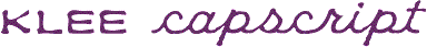
Klee CapScript was based on beautiful, tiny hand-drawn lettering in the mail art invitation to Emma Klee's Color Museum project. The upper case is based on Emma's capitals and the lower case is freely adapted from her script. The font is designed to be used with words either in capitals or script, not both, just like in her original invitation.

Many more free fonts and inexpensive payfonts are available from my foundry website, K-Type. Custom fonts can also be made to order.